
Four groups of participants sorting their cards
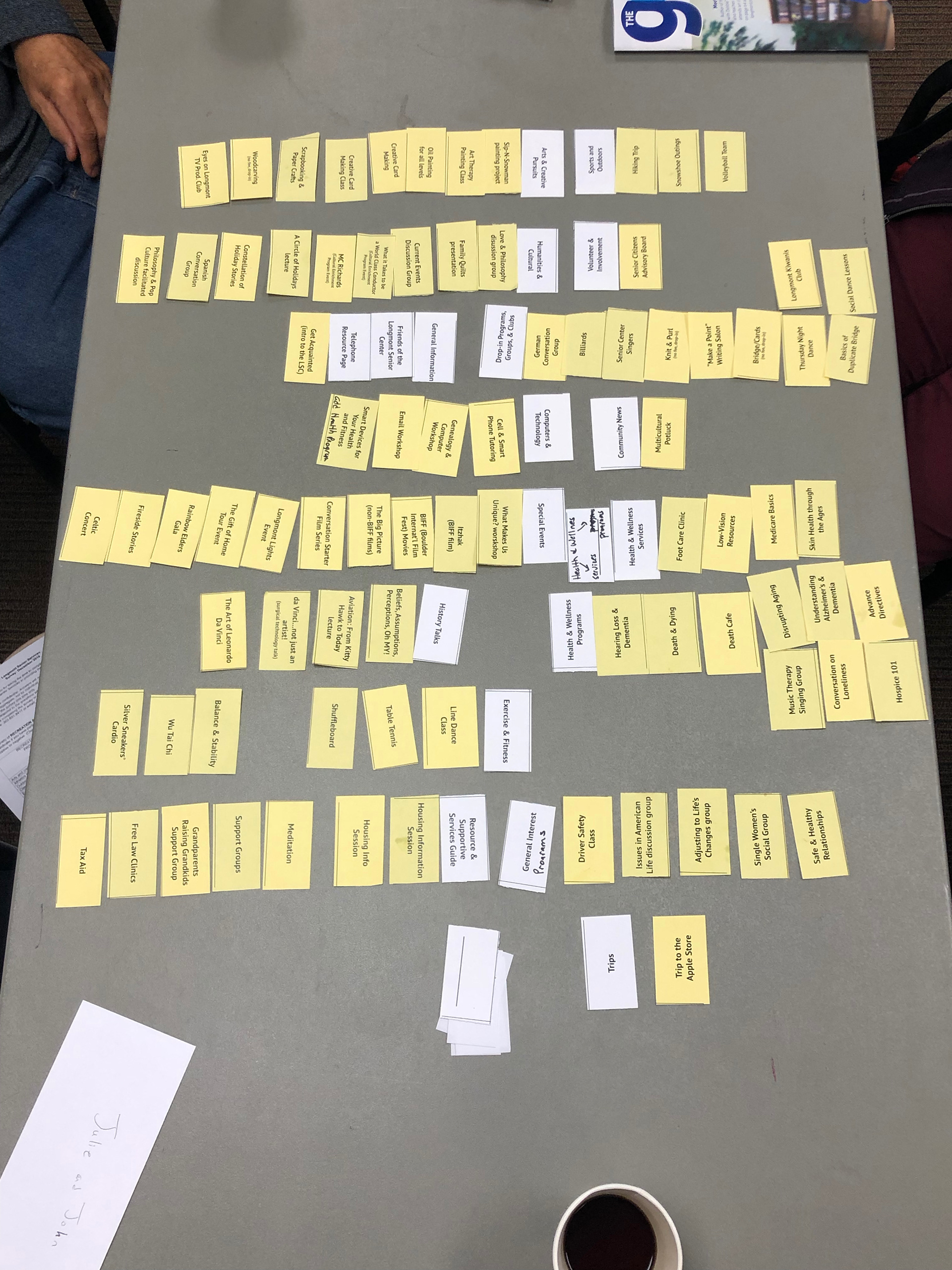
One table's category results
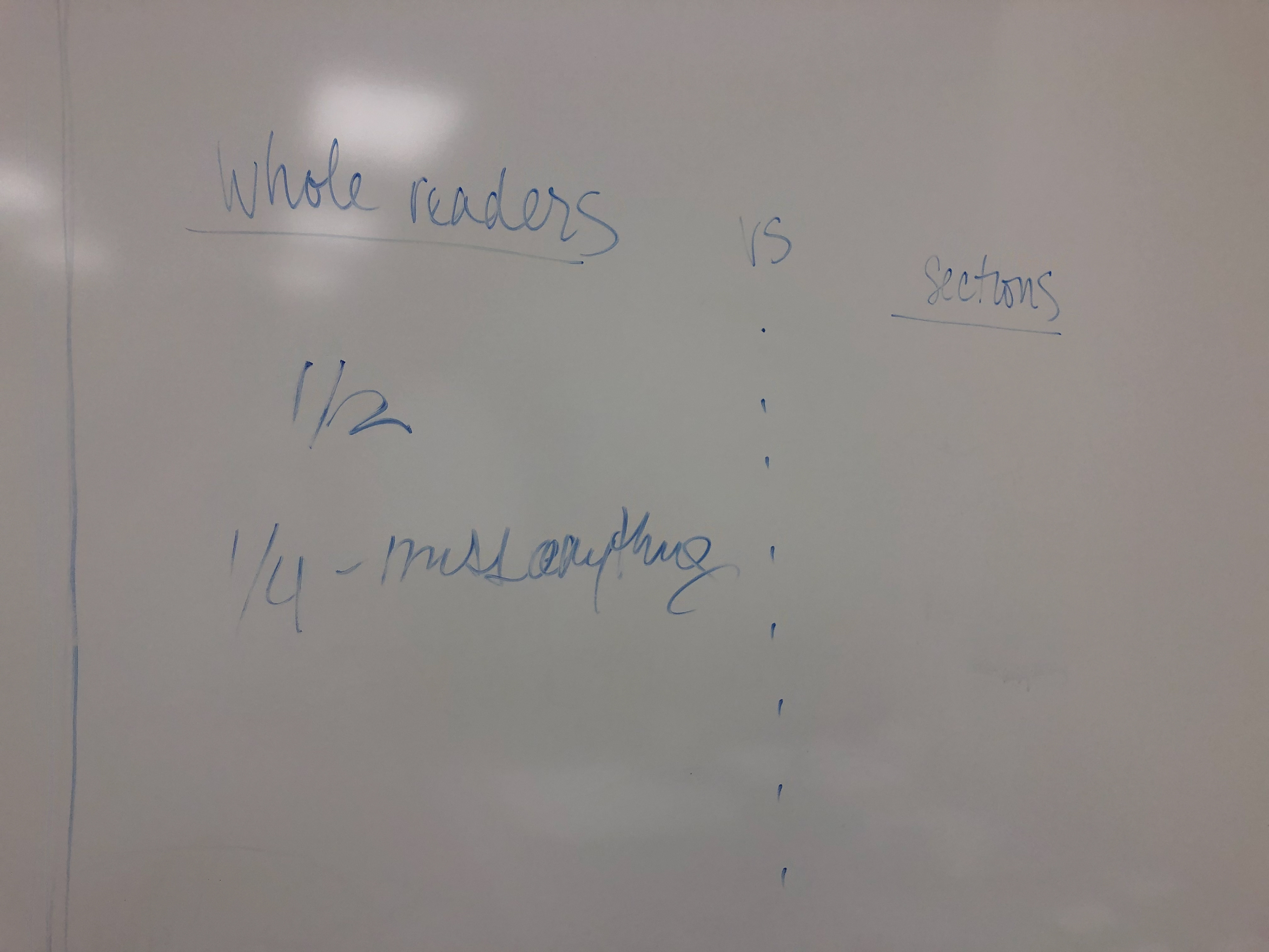
Informal notes; session was also recorded.
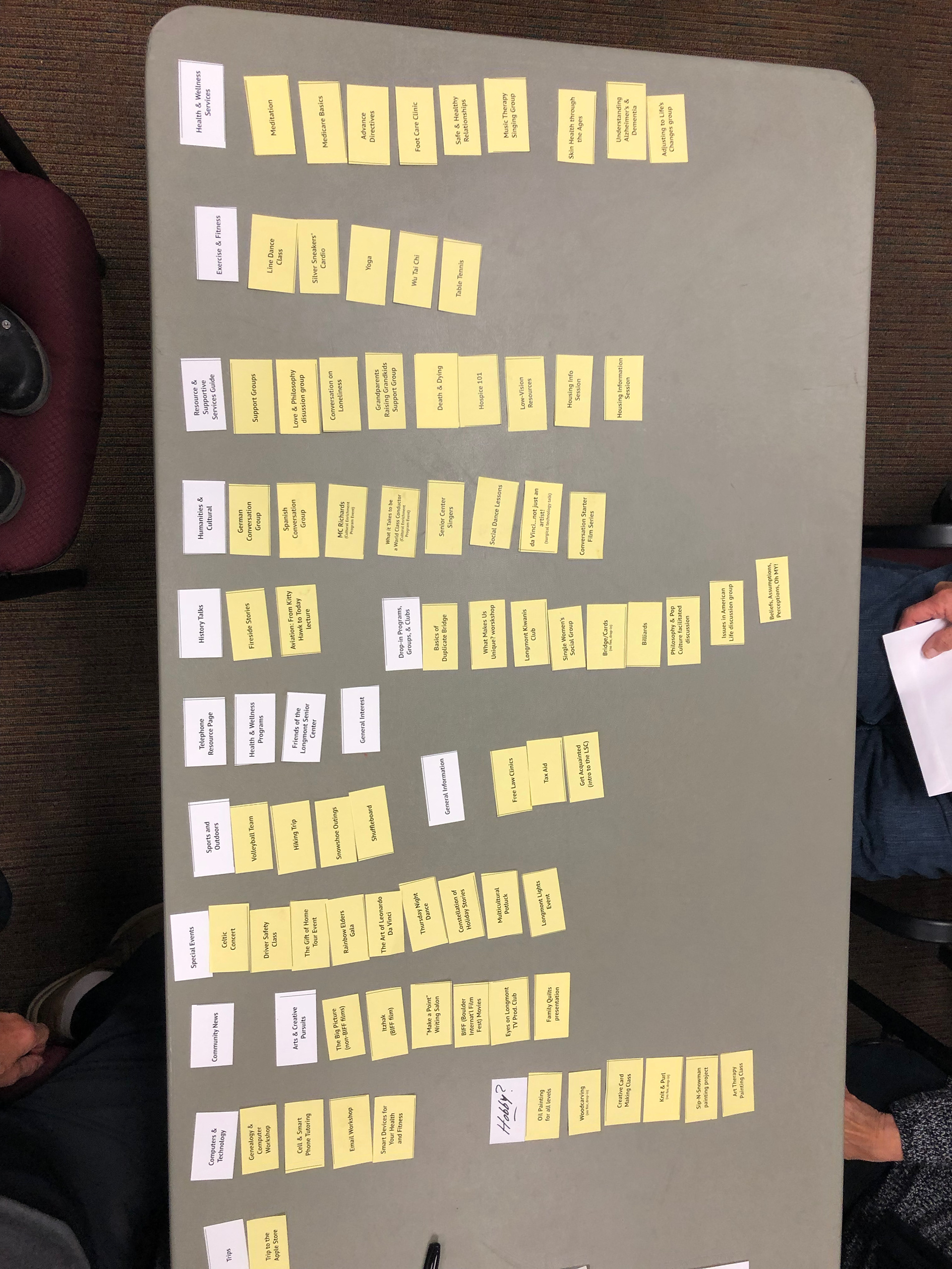
Another table's card category results
Senior Services GO Catalog
After internal discussion over the merits of adding an index to our quarterly programming catalog, I did what I do best: asked our users. This is a classic card sort exercise and focus group.
Volunteers were screened for existing clients, Spanish-speaking clients, and non-clients new to the GO. Card sort exercises are often used in usability testing for website navigation, and the principles translated easily to the categorized nature of our print catalog.
Our session garnered a great deal of insight and after the data was compiled, I used our results to create an indexing and data entry system in MS Excel. Leadership changed their mind about implementation following this exercise, but the structural system to implement an index for the GO still exists should we revisit this improvement.
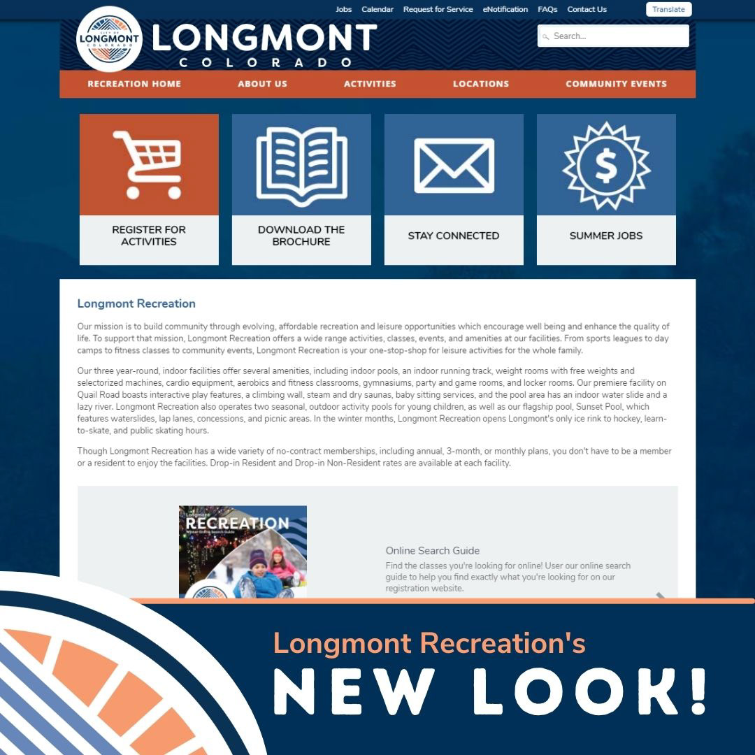
Longmont Recreation Microsite
Often, in UI/UX work, we are constrained by vendors, permissions, access, technology or other hinderances to creating a perfect product. But, perfect is the enemy of good, and there's always a "yes" in there somewhere. The Longmont Recreation microsite is a great example of getting to "yes".
Working through a limited suite of drag & drop "developer" tools through our website vendor, my team and I started with Google Analytics and Keyword Planner data, and usability interviews (a stretch during COVID) to get to a product that is more intuitive and easy to understand than our previous 180+ page site full of industry jargon.
A combination of streamlined content, color, layout, and copy editing (changing 'aquatics' to 'swimming') resulted in a new microsite for Longmont Recreation that guides users' behavior to register for activities online and to more quickly navigate to the information pertinent to their needs.
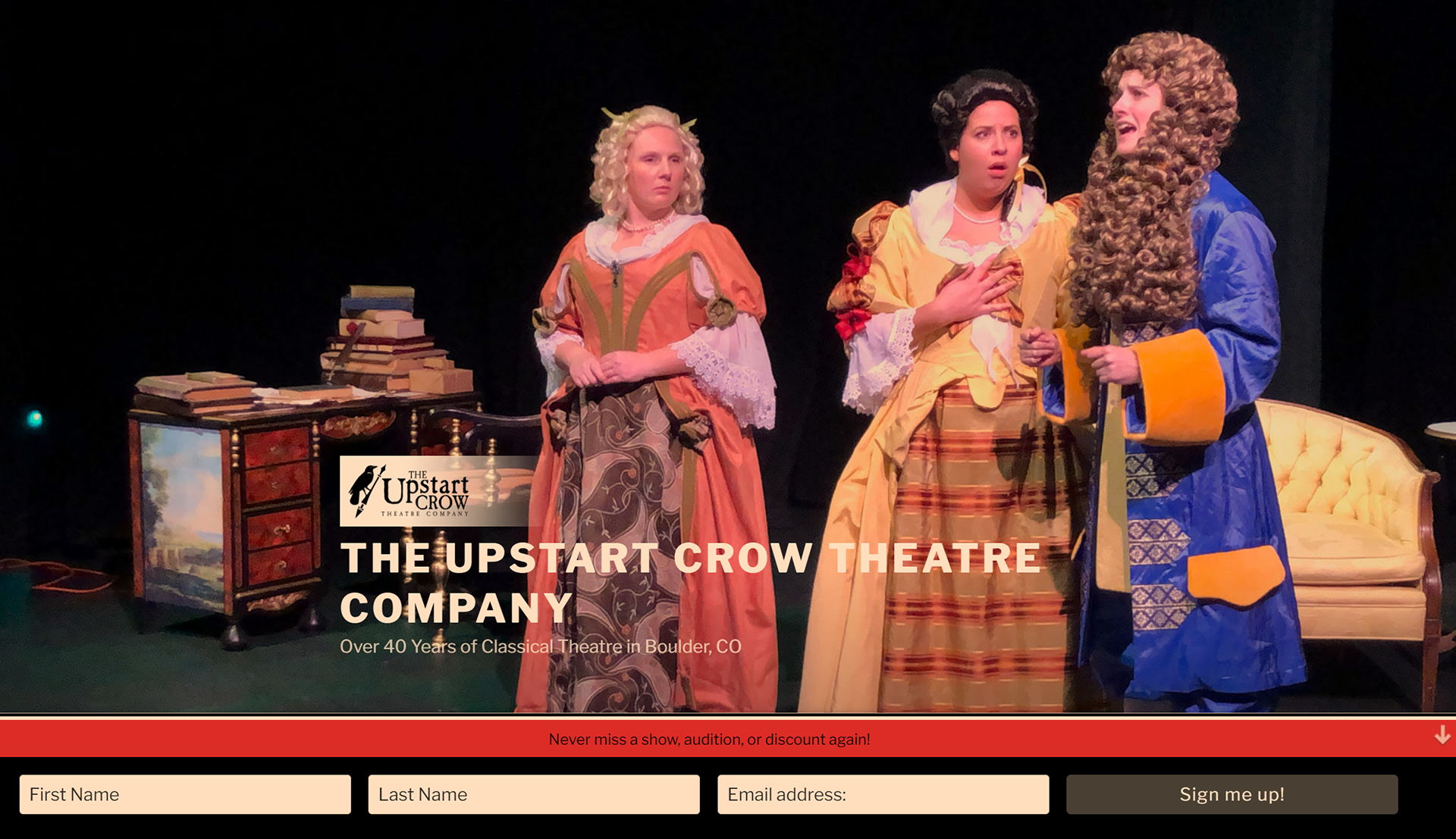
The Upstart Crow Theatre Company
When the 30-year-old local theatre company wanted to update their 20-year-old PHP website, they called upon Griffin Street Studios to help revamp the look and feel, but also the ease of use for both end-users and administrative staff.
Previous to this update the site required extensive knowledge of html, PHP, and CSS, and several elements were hard-coded into the site making it difficult to adopt a dynamic and consistent approach to updates. Administration of the site was difficult to distribute among volunteers with little tech experience. The design was cluttered and the focus was scattered.
The new Wordpress installation of The Upstart Crow website capitalizes on some custom CSS to get end-users to the key action--namely, buying tickets--and to help administrative staff better keep the site up-to-date.
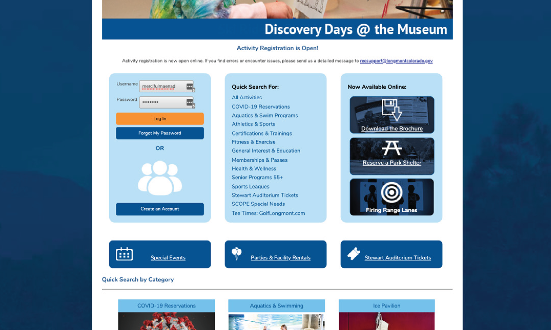
RecTrac for Longmont Recreation
Working directly with Vermont Systems and our ETS team internal to the City, I was able to code a custom landing page for our online registrants to reduce overall clicks, confusions, and to reduce abandon carts due to user frustrations.
Like other platforms, there was limited capacity to make architectural changes to the site. However, after conducting several usability interviews with local residents, I was able to identify key pain points and use a combination of CSS and programmatic design solutions to mitigate the stresses of those pain points.
Ultimately, our dream solution was not a viable "yes," but a compromise of design solutions helped reduce frustration overall and lead to fewer customer service phone calls from frustrated users.
Update: the option for custom UI has since been discontinued, and the current RecTrac website comes to us from Vermont Systems as an OOTB solution with limited customization options.
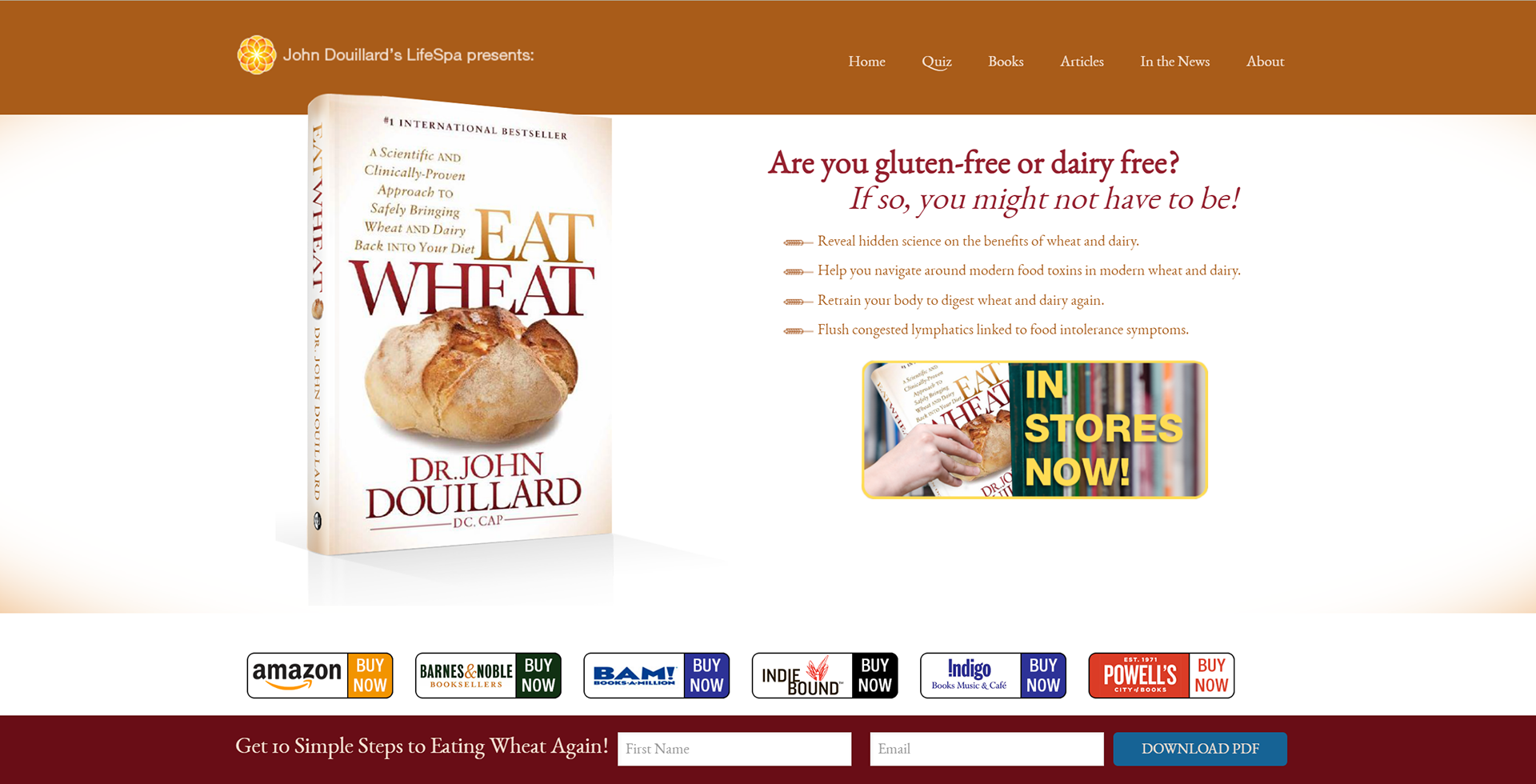
LifeSpa and Eat Wheat
In 2016, I was the principle on a core team assigned to redesign the LifeSpa website and eCommerce store, and to build the Eat Wheat Book website. As the team's principle liaison to the design firm, I was responsible for conducting the usability interviews, data and research, and for compiling our documentation.
Previous to the rollout of the new websites, our aspx eCommerce site was clunky and rife with abandoned carts. Our team focused on usability, scalability, and conversions, and the resulting website was met with resounding success.